Showing posts with label Photoshop. Show all posts

Monday, September 28, 2015

Aphrael Red FINAL!

Greetings and salutations! Today I will show all of you the completed work for Aphrael Red. Yay! First up is the final 3d art piece:


I think the character came out okay. She is my first truly completed 3D model for a game. I did all of the textures, modeling, rigging and animation for the character. I am certain there is some areas that need improvement but I am satisfied with the results at this point. Right now I even have her animated and playable somewhat in my game prototype Prism. However, before I get to that, I also wanted to show off the main props for Aphrael. First is the handgun.


This is Aphrael's handgun. The design was inspired from several sources, including a Baretta M9, a Varista from Phantasy Star Online, and a few other little things from various sources. In addition, I tried to keep the same motif of the weapon with Aphrael's sword to illustrate that the same manufacturer builds these weapons. I also wanted sharp, clean simplified lines with the overall aesthetic, giving it an authentic, yet futuristic look.

The textures themselves were interesting to build. I first made two texture maps, a diffuse map and an RGB mask. The RGB mask is used to tell Unreal what texture appears at what UV coordinate. After creating these, I made another RGB mask and diffuse map. These separate maps were used to tell Unreal where the decals on the handgun would be such as the text on the side of the barrel or the red safety mark by the safety switch.

Getting a good metal texture is one of the hardest things to do in 3D visual arts. However, after much practice, I have devised several ways in achieving different metals like the stainless steel and matte black metal of the body of the gun. Both use a tiling texture to create the base properties of the metal. This texture is not in the actual diffuse but is actually controlled by the roughness, or glossy output of the material. Both use a simple noise pattern, but how they are tiled and their specularity settings is what makes the difference. For the stainless steel, I have the noise pattern tiling in mainly one direction and in the other direction, squeezed to a point where it looks like fibers. For the black matte metal, the noise is processed through an inverse node so instead of being shiny and reflective, it is matte with some light reflected due to the density of the noise pattern, giving that metallic matte finish to the material. The overall shader is actually quite simple, but you have to know what you are doing to get these kind of results with as little work as possible.

Now the shader settings for the handgun were copied over for use with Aphrael's sword which you can see below:
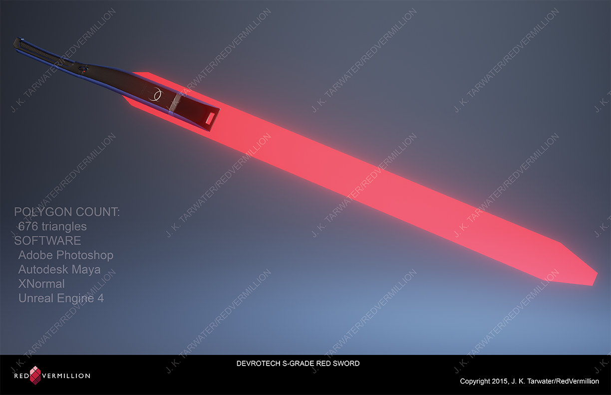

I used the same techniques here for the textures, RGB masks for the texture and decals layout, then two diffuse maps to define the color. Everything else is tiled and controlled by nodes in the material editor in Unreal. The blade itself is even simpler, using an emissive shader along with transparency to give the blade that energy-like feel since it is supposed to be an energy blade, not a solid one. The emissive part itself has a strength setting that I can tweak to control the strength of the glow. Also, note the design aesthetic of the hilt. Again, clean, minimalistic lines to give that futuristic feel. That is carried over onto the handgun and vice versa.

Now as I mentioned earlier, I have Aphrael in the early prototype of the game I am making, Prism. The last pictured I showed had trees and water, but not really much else. Here is a screenshot I rendered from Unreal of the changes to the level since last I posted about it:


Now it is starting to look more like a forest. The ferns were actually more of a hassle than anticipated to texture because of my usual method of creating textures. When I create plant textures, I usually look up several sources of photographs, chop them up into unrecognizable bits, repurpose them into a new image (a collage you can say) that looks good for a texture map of a plant, and apply that to the mesh. However, I could not find the references I needed to do this effectively for the ferns. Thus what I did is I closely studied the structure of the ferns and their leaves and then hand painted in Photoshop an individual leaf. I then copied and duplicated this into a larger texture with the stem of the leaf. Finally, I used this large leaf on an even larger texture with the actual branch, copying and pasting the smaller textures to create the whole main structure and placing it on a plane for the fern. Then in Maya, I copied this single mesh by using a duplicate tool in a 360 rotation several times and got the effect I was looking for, a functional looking fern. To ensure a little randomness to the mesh, I slightly rotated each tier of leaves slightly off center to give a more natural look.

The material of fern itself was simple enough. I created a normal map from a desaturated version of the diffuse texture in XNormal and then tweaked the specularity settings to get the appropriate shine of the leaves in the sunlight. Ferns have a slight sheen to them, so I wanted to try to capture that with the normal map and specularity settings. It gives the ferns a much needed sense of depth and three dimensionality. After that, changed the shader settings to a two-sided foliage and used a brighter version of the diffuse map for the subsurface lighting in the leaves. This really makes them seem more realistic, especially at a distance when sunlight is shining through the leaves of the trees.

One final thing I wanted to point out to was the texture for the water. In the game itself, the water moves using a simple panning node on two tiled normal maps combined with a depth fade. If you notice, the water is not as rough and turbulent as it was in my earlier post. One of the problems I had with the water is that it made the pond to stormy and choppy looking. The area doesn't have that much wind, just subtle breezes. In order to reflect this accurately in the water, I had to rework the normal maps. This didn't take long, especially since I use the same tiling texture for both normal maps. Its just that one of the textures is rotated 90 degrees in relation to the other. In addition, both textures use a slightly different panner node so they move at different speeds, giving the illusion of small waves on the surface of the water. Finally, a Fresnel plugged into the refractive output of the material is used in conjunction with those same normal maps to crate the reflections on the surface of the water.

So Aphrael herself is done at this point and the forest level is starting to really come into its own. I hope all of you enjoyed what you have seen and understand what I was explaining about the textures and how they were made. Next I may go into further detail about the rig that I used for Aphrael using Unreal Engine 4's wonderful Maya plugin, the Animation and Rigging Toolkit. This tool is a beast and it made building the rig and animation much easier and faster. I may go ahead and talk about this next so stay tuned!

Friday, July 10, 2015

Aphrael Red Update!

Greetings and salutations! Today I want to show two of the props I have developed for Aphrael. The first is a handgun that she will be able to pull out and use and the second is her primary weapon, a crimson energy sword. Here's what they look like:

Aphrael's pistol.

Aphrael's sword.
I am quite happy with how they are turning out. I am not done with them yet as you can see with the normal map artifacts on the pistol. I will need to paint those out with Photoshop.

The props aren't the only thing I have to show. I have updated some of the textures for Aphrael and I need a few more meshes to complete. In addition, I now have a rudimentary rig set up so I can test movement, camera location, and some controls as well.

Aphrael in the studio environment I built.

Aphrael in the actual level environment.
Ah yes, I forgot about the water. I created a new custom water material after watching a few tutorials online. It took a bit and I think it still needs work. It's just a pond so I need to tone down the waves a little bit since it's not that windy in the level. There's wind, but not enough to generate that much turbulence on the water's surface.

Another issue I am having and some people noticed this is that when the level is running, Aphrael seems a little out of place in the environment. What I mean that she doesn't seem to blend into the game. It's almost like she is rendering in front of blue screen, but more obvious. I don't know if that is because I am not done with the textures yet or not. I will have to look more into this. I'm also still struggling with the post-processing settings. I am not for certain how to adjust these or turn them off during actual game play. I need to do more research.

Anyway, I'll try to post more often, but my schedule is about to get really hairy. I am entering my final semester next week and I have only ten weeks left to get all of this done for the portfolio show. I also need to order business cards, get another character done, have the plans for the booth set up and ready to go, etc. It's about to get crazy so hopefully I can survive and finish!

Monday, April 27, 2015

Prism Level Update

Greetings and salutations! Today I will share a little bit of my prototype level for Prism. Here is what one area looks like in the Unreal Engine 4 editor so far:

Prism prototype level in progress.
As you can see, I finally have grass and trees and the entire map is now actually laid out. I need to cover the entire map with the grass and trees but so far it is looking good.

One of the problem areas I was having with the grass was making it look like grass. After many attempts, I finally just painted it myself by using a Photoshop filter and then masking out an initial shape for a blade of grass. Then I copied that shape and used the warp tool to create different blades and pasted them into a coherent texture I could use on a single plane. I then built up several of those planes in Maya and then imported it into Unreal. As you can see, the result is quite marvelous. However, the grass is processor heavy and it slows the editor down on more conservative systems (ones that aren't mine anyway).

Speaking of Maya, Autodesk just recently released Maya 2016. After playing around with it for quite  a bit, I must say that I am happy with the results. It is far superior over 2014 and 2015. 2014 was my go to so I think it is a big deal to find a version of Maya that is better than 2014. One of the things that I like the most is the new interface. Take a look:

The new Autodesk Maya 2016 interface.
The interface is very clean now with much more readable icons. The menus have been cleaned up from the mess that was 2015 and there are many new useful tools such as an entire sculpting shelf now. Even the UV editor has new tools and they helped me clean up some stretch issues I was having on Aphrael's face. I always had problems getting the face to have minimum stretching and now the new tools in the UV editor fixed it quite easily. I am very happy.

I am not for sure what I will post about next. Stay tuned though and sorry for the lack of posts last week.

Monday, January 12, 2015

Aphrael Red!

Greetings and salutations! Today I present you with a finished 2D drawing of my first hero and leader of the Four Heroes, Aphrael Red!

Aphrael Red 2D art
Here is a close up of her face so everyone can see her clearly:

Close up of Aphrael
I would say it probably took me around twenty hours off and on over the weekend to complete this. I am quite happy with the results and I believe it is far superior over my Beloved Heroine piece that I showcased last week. Now that the 2D concept (or is it promo?) art is done, let me explain a little bit about my process.

The majority of artists as far as I can tell usually block in all of the colors on the entire character first before getting into the details. I have worked this way before but I do not find it very productive for a finished piece. The reason for this is because I am quite lazy. I hate having to work super hard and only get a minimum amount of work or miss details when focusing on the overall image. Therefore, to make my work more manageable so I don't get overwhelmed, I divide a piece into smaller pieces so I only need to focus on that part of the whole image. This makes doing large works far more enjoyable. In addition, this allows me to evaluate each individual piece as part of a whole when I complete each one so I can determine if it fits with the rest of the image I am trying to convey. If I don't like it, I can go in and edit the piece separately until it matches the rest of the image. This method gives me far more control and allows a more tighter finish to the overall work. To provide an example, let me show some of the stages this piece took to get to the final image:

The head and jacket with the overdrawing
I always start with the face first because it is the most difficult to get right. Everything about a character whether it is their emotions or their history is shown in the face. First I block in the main base color, usually a medium tone and then start painting in shadows and highlights. Of course before I even do this, I take a moment to plot out where the light source is coming from so I'll know where to paint shadows and highlights. Once the shadows and highlights are done, I start to paint in more detailed shapes like the mouth, the nose, and so on. The eyes I have on a separate layer group so that they do not interfere with the painting on the face. Once I am satisfied with the face, I can move on to her collar and jacket. I do this with all of the other layer groups and when one layer group is done, I zoom out and check the whole piece to ensure everything looks right. If it does, then I move to the next piece and so on.

Ruffles and the main shirt added
The ruffles on her skirt took an incredible amount of concentration to get done correctly. The shapes of ruffles are complex because they are many, many folds in a small space. Painting that is difficult but I think I succeeded there in the end. I also enjoy the detail on her belt. I don't usually go too detailed on belts but here I felt it was necessary to provide a bit more authenticity to the outfit.

The base color block for the legs
Here is an example of blocking in the base color of a piece, specifically here it is her legs. As with the rest of the image, I used quite a bit of reference to get the color of the material correct, to capture the faint transparency of very dark hosiery, and to capture the shape of Aphrael's musculature through the hose. Her legs are an important part of the piece, so I had to pay extra attention to make sure I got it correct.

The completed sword
I am very happy with how her sword came out in the end. I changed a few minor details on the design, but overall it came out extremely beautiful. The very minimalist but slender design of her sword really gives it a nice, pleasing aesthetic. In addition, to break up the monotony of the black metal, I placed a lighter gray stripe on the quillions and added some random symbol and simulated text to give it a look as if the weapon is mass produced. In addition, I painted in the off-on switch similarly to how it is shown in my sketches to give the weapon more character. Finally, the energy blade itself is red to draw attention to it and to add more symbolism to the hot fiery heart that Aphrael possesses.

One thing that I want to direct attention to is the Layers panel. Notice that I have every layer and layer group named. Every digital artist that uses a program that allows the use of layers should do this as it keeps everything organized and it allows one to know what they are working on or where to find something they are looking for. In addition, it also allows one to lock a specific part of an image so you don't accidentally paint over it later.

I hope people like the design. I know I do. However, after I showed it to my brother, he brought up an interesting point: the outfit that Aphrael wears is more suited for someone much shorter. As everyone is aware, I designed her with heroic proportions in mind (9 to 10 heads tall). My brother thought it was a little odd because a tall person probably wouldn't wear an outfit like the one Aphrael wears. I'm glad he mentioned this because now that I think about it, it actually makes the character even more unusual and quite appealing. Can you imagine a young twenty-something who is almost six feet tall prancing around like a graceful dancer in a frilly outfit like the one Aphrael wears and swinging her sword around in beautiful long red arcs? Quite the sight I would say. Of course there was a more practical reason why I designed her this way which I had explained before and that was so I can highlight her legs along with the physical strength she possesses in them while she prances around swinging her sword. She is supposed to move with a dancer's gracefulness and designing her this way I think helps emphasize this.

Now that the final concept for Aphrael is complete, it is almost time for actual production. The first thing I need to do now is creating the model sheets for the 3D model. After that, production itself can actually begin. My workflow for this stage is the following: I will sculpt a hi-res mesh using either Sculptris or Blender then create a lo-res model in Blender as well. After the lo-res is done with the correct topology, I will UV map it in Maya and then bake the normal maps in Blender. The reason I am using different programs for some of this is because I just prefer one software's methods of doing things over the other. The Four Heroes is not intended for commercial use so I can use Maya for my UV mapping. In addition, I do not have the funds to purchase Zbrush at this time so I have to use what I have available to me at this time.

Anyway, once the baking of normal maps is complete, I can go ahead and bake a color map and then create the textures in Mudbox and Photoshop. Once texturing is complete, I will create an IK rig driven by an FK setup and then create a facial rig so I can create expressions and emotions. Finally, I can set up a light rig in either Unreal Engine 4 or in Marmoset Toolbag and create a final render in one of those programs. The reason for this is because all of this work is for my portfolio which will be completed by the time I graduate. If I can demonstrate my ability to create the best graphics available in realtime rendering engines which is what modern games use anymore, then that will show my competency and my understanding of pipelines for any game studio wishing to hire me.

Next time, the last stage of my pre-production will be highlighted: the model sheet. Then actual production for my 3D character can begin!

Stephanie Valentin

Before I end this post today, I just want to post a shout out to Stephanie Valentin. Her YouTube tutorials have been a godsend for me over the last few years and have really helped me to improve my art tenfold along with the techniques I have learned at The Art Institute. For any artist seriously wanting to reach photographic levels of excellence in their digital paintings, watch her tutorials. They are easy to understand and the techniques employed can be incorporated into your own style of work. Her channel is here at https://www.youtube.com/user/StephanieValentin. Thank you Ms. Valentin!